Themes
One of the best features of Gridmonger is that it comes with 32 high-quality themes out-of-the-box. Furthermore, the program also allows the modification of the built-in themes and the creation of entirely new ones.
You can cycle through the themes in forward or reverse alphabetical order with
Ctrl+PgUp and Ctrl+PgDn in Edit Mode. The name of the
theme in use is saved into your map file; when loading a map, the theme will
be restored, or if it cannot be found, the Default theme will be used.
Tip
If you’re on a laptop that doesn’t have PgUp and PgDn keys, you can use Ctrl+Fn+↑ and Ctrl+Fn+↓ to switch between the themes.
Theme conventions
All built-in themes follow a few simple conventions: themes prefixed with
[W] are designed for world maps, while the ones starting with [WD] are
meant for mixed world & dungeon maps. Unprefixed themes are best suited for
regular dungeons.
The differences between them basically come down to the selection of floor
colours: world map themes feature colours suited to represent different types
of terrain, while in regular themes they are just different accent colours.
Colours are generally consistent across themes belonging to the same type;
e.g., in regular dungeon themes, colour #2 is always a reddish colour, #3 a
bright red/orange, #4 a yellowish one, and so on. This makes it a bit easier
to switch themes in the middle of a mapping session. A few themes even include
variations that don’t conform to these conventions (e.g., Darkest Heart
Alt).
Theme editor
While it is certainly possible to edit or create theme files only with a text editor, Gridmonger features a fully-fledged theme editor that makes theme management a breeze.
You can toggle the theme editor side panel with the F12 key in Edit Mode. Note that it is not possible to toggle the editor while a dialog is open, or in any other modes (e.g., Select Mode or Paste Preview Mode). You can, however, enter any of these modes while the theme editor is already open, which makes editing aspects of the themes related to these modes a lot easier.
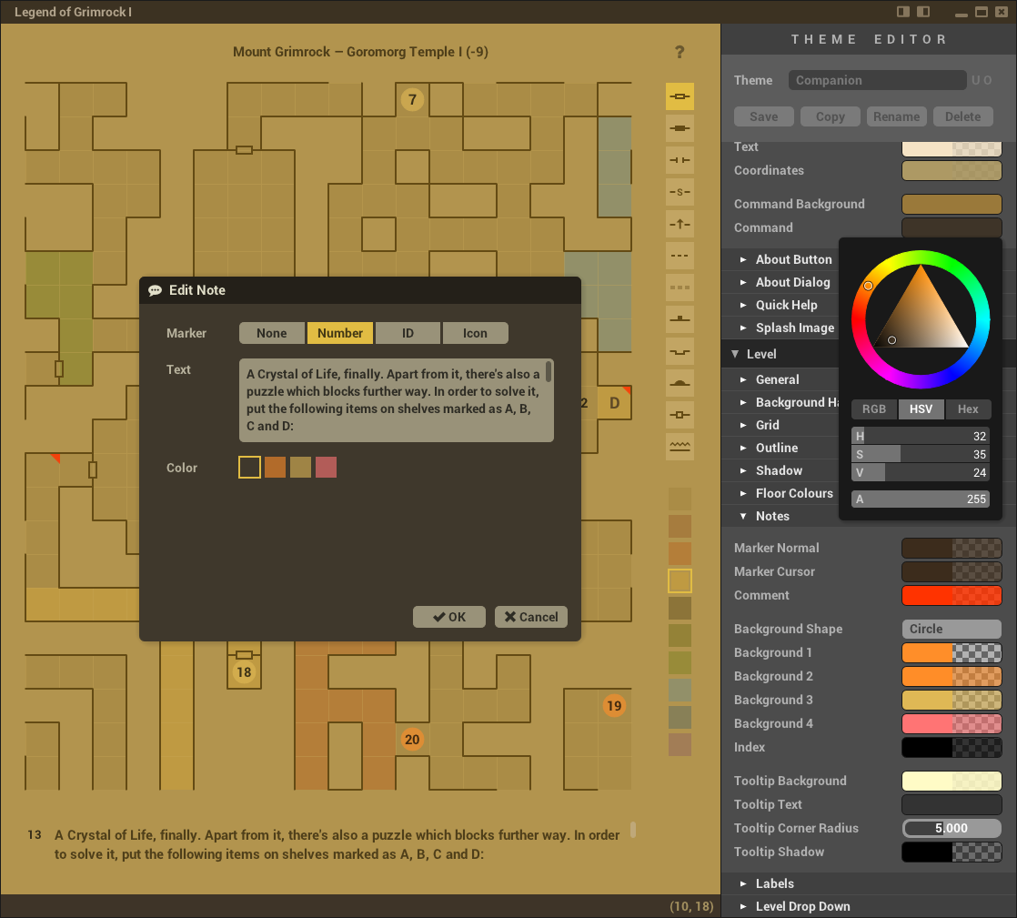
The theme editor in action
At the top, there is a drop-down indicating the current theme. You can change this any time, except when a dialog is open. Naturally, if you try to switch to a different theme and the current one has unsaved changes, the program will display a warning dialog.
To the right of the drop-down are two state indicators:
U– User themeO– Overridden built-in theme
Below the drop-down are four action buttons — let’s look at what these do first, which will also clarify the purpose of the indicators:
- Save
Saves any changes you’ve made to the current theme.
Built-in themes can never be changed, so if this is a built-in theme (
UandOare inactive), a new user theme will be created with the same name, and therefore theUindicator will become active. This user theme overrides (or shadows) the built-in theme, making the built-in theme unavailable, therefore theOindicator will also become active.Overriding a built-in theme is useful when you only want to make a few tweaks to it; your map files will still reference the name of the built-in theme, but the program will use the overridden user theme instead.
- Copy
Creates a copy of an existing theme under a different name.
This is the action to use if you don’t want to override a built-in theme (e.g., if you want to create a new tweaked version under a different name), or if you want to design your own theme — just pick a theme you want to use as your starting point and press Copy.
You’ll be asked for a new theme name, and you’ll get a warning if the name you’ve chosen would override (shadow) that of an existing built-in theme, or would overwrite another user theme. Naturally, you can make copies of both built-in and user themes.
- Rename
Renames a user theme.
Similarly to Copy, you’ll be asked for a new name, and you’ll get warnings about any possible naming conflicts. This button is disabled for built-in themes.
- Delete
Deletes a user theme.
You can only delete user themes; for built-in themes, this button is disabled.
The rest of the editor should be pretty straightforward. The best way to get familiar with theming is to experiment! There are, however, a few things that are bit harder to figure out, so let’s say a few words about them:
Hold Ctrl while clicking on the little triangle before a section’s name to open all its child sections as well.
Hold Shift for finer adjustments when changing value sliders by click-dragging, and Shift+Alt for super-fine adjustments.
When adjusting a value slider by click-dragging, you can right-click before releasing the left mouse button to cancel the change.
To copy a colour, hover over the source colour widget, press Ctrl+C, then hover over the destination and press Ctrl+V.
To use a background image, first copy the image to the
User Themes/Imagesfolder, then enter the filename (without the path part) in the Window / Background Image text field, and press the Reload button.To display the splash image for theming purposes, tick the Show Splash checkbox under User Interface / Splash Image, then untick it when you’re done.
Note
There is an input lag of one extra frame when the theme editor is open. This limitation might be removed in a future version; for now, just keep in mind that it’s best to keep the theme editor closed when you’re not using it.
Theme files
Themes are text files with the .gmtheme extension. Built-in themes are
stored in the Themes subfolder in the application folder. The
Themes/Images subfolder contains the background images used by some themes
(at double-resolution to support high-DPI displays).
User themes live in the User data folder.
They have their own User Themes/Images folder; the loading of user theme
images are first attempted from here, then if that fails, from the
Themes/Images folder. Because of this, when you make some adjustments to a
built-in theme (creating an user theme that shadows the built-in theme in the
process), the images files do not need to be copied.
Tip
Press Ctrl+Home (or Ctrl+Fn+← on laptops) to refresh the theme if you have changed the image referenced by a theme, or if you’ve modified the theme file directly.
Note
The list of available theme files is only looked up at startup. If you’ve modified the contents of the theme folders directly, you’ll need to restart Gridmonger to see the up-to-date theme list.